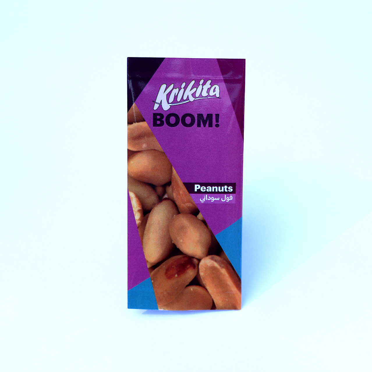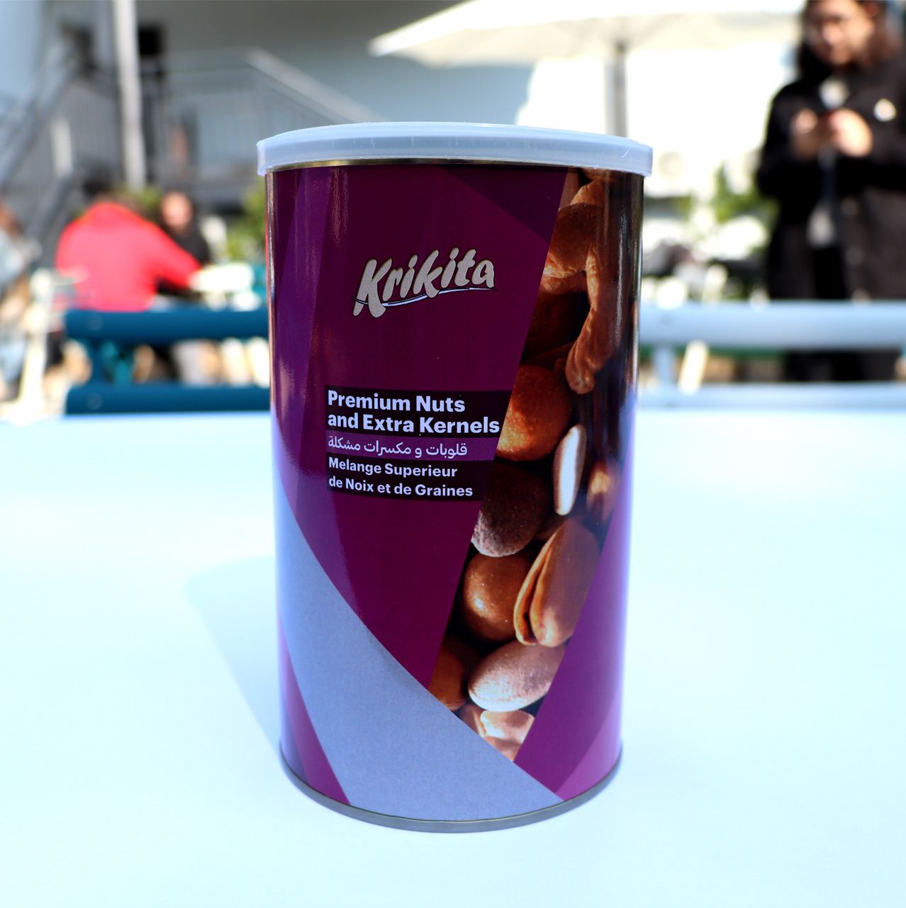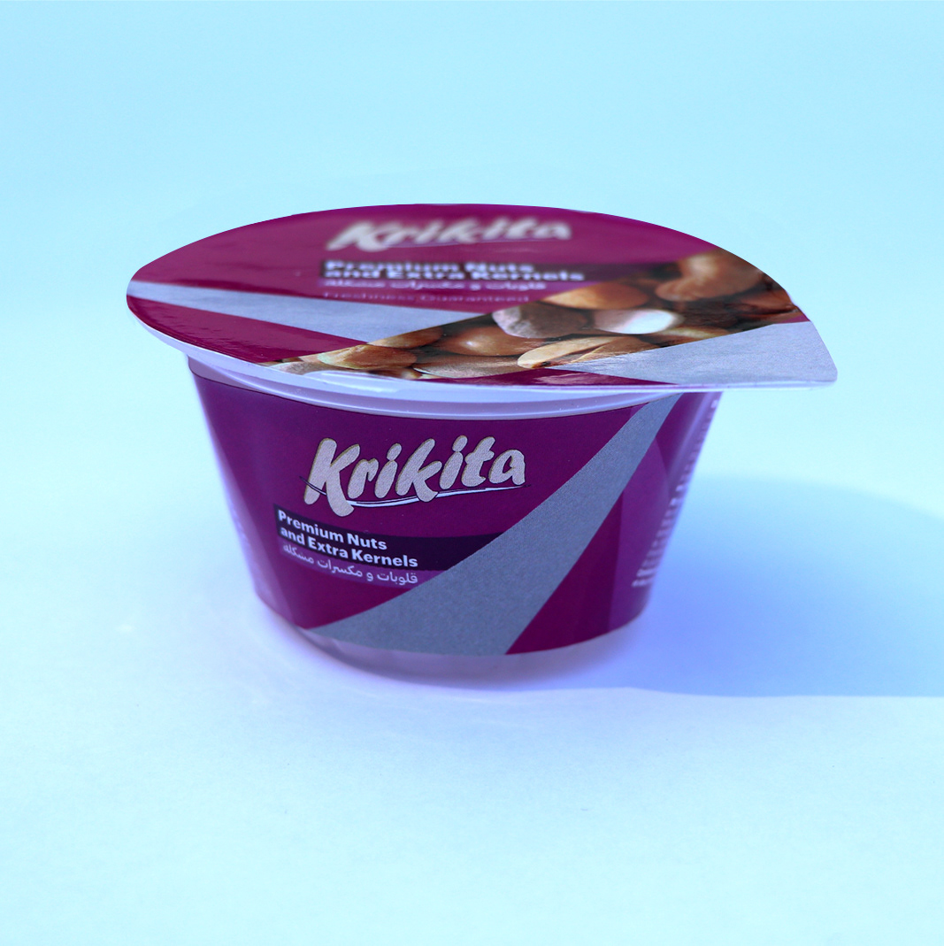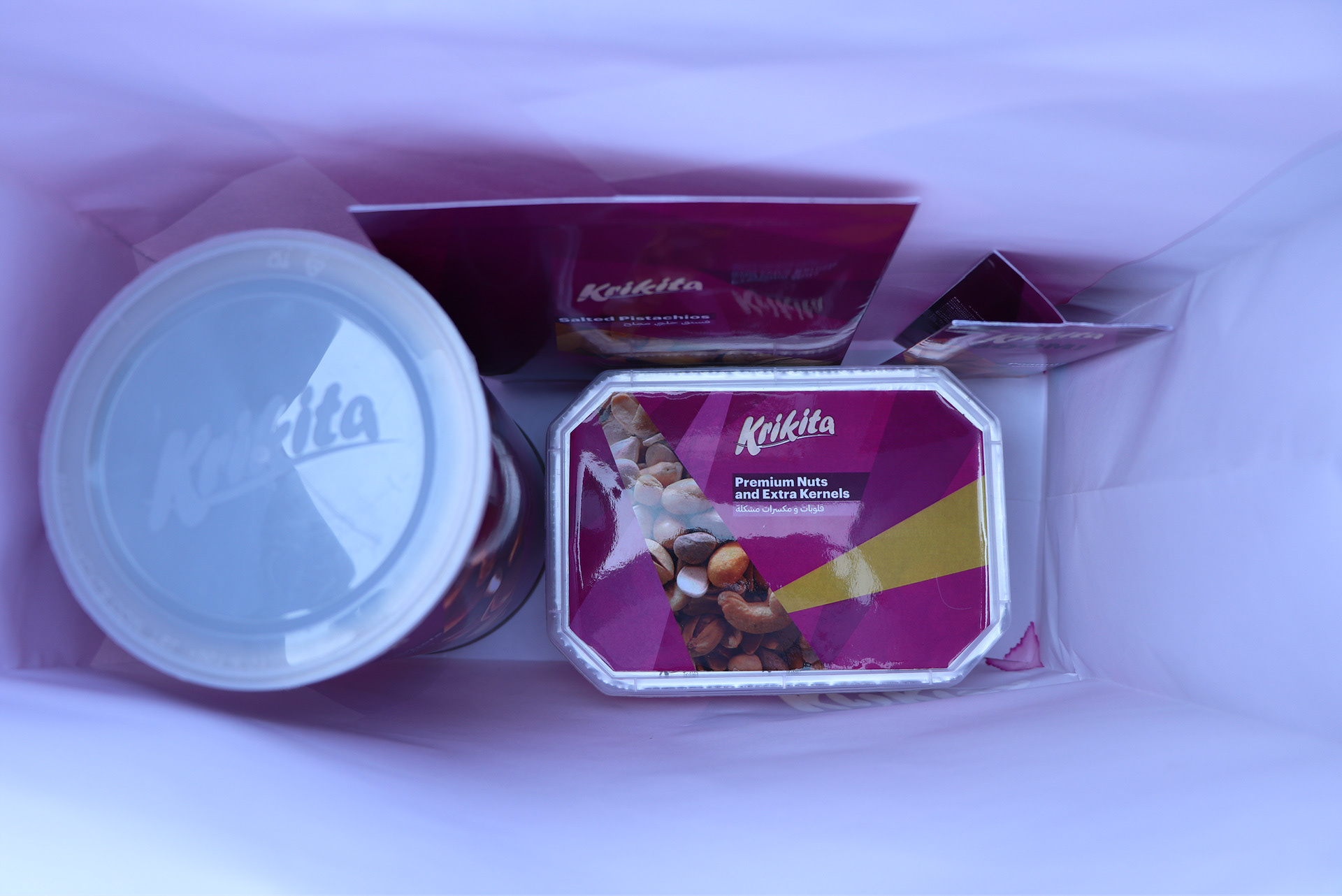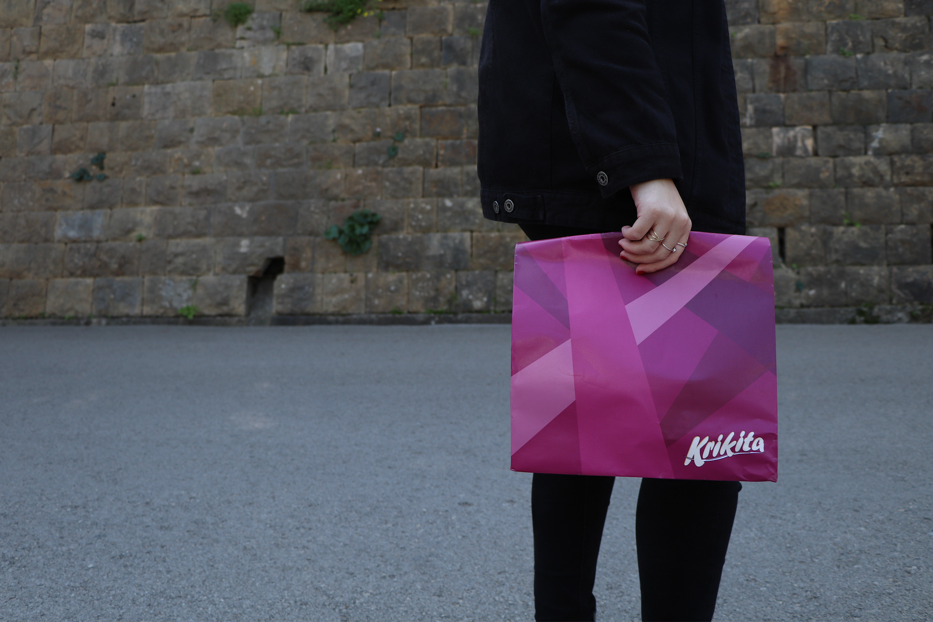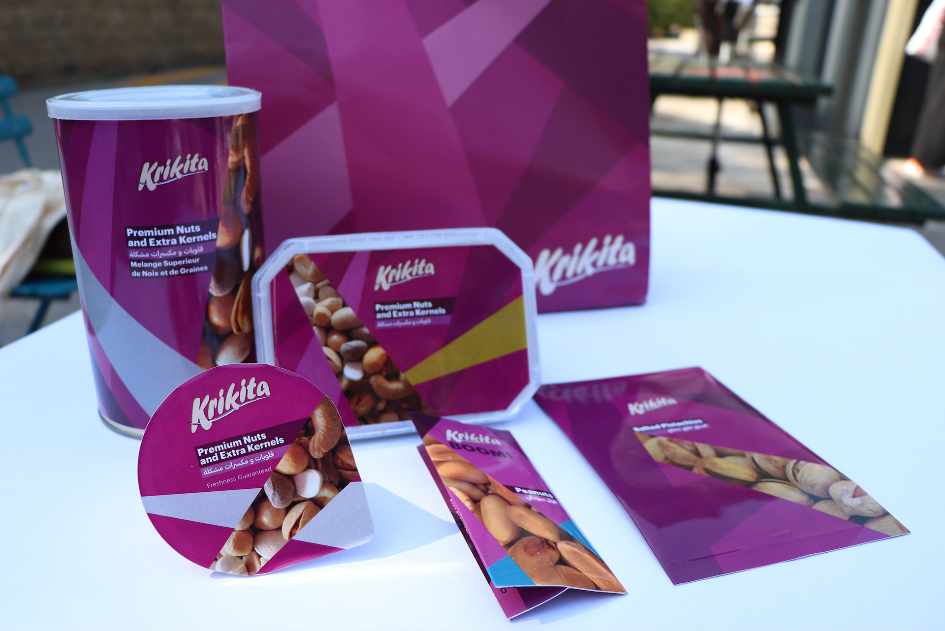
Local brand's packaging line redesigned
//
Attempting to stay true to the original elements of the brand, I kept the overpowering color of purple, the coding of package type [gold, silver...], and images displaying the nuts, but decided to treat them in a more appealing way. Using their original logo and reciprocals, the aim was to give the line an abstract design using the overlapping shapes. These shapes are then used as the coding center of each product to mask images and colors that are respective of the product.